
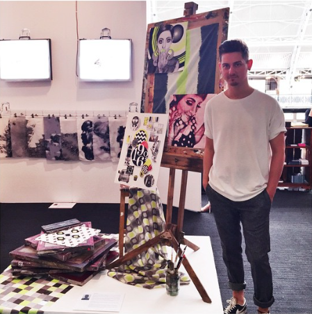
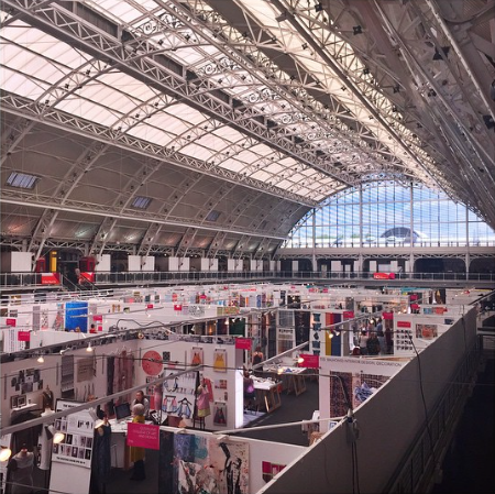
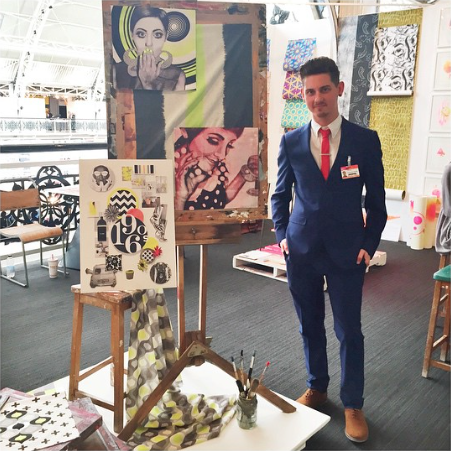
From the 24th - 27th June I had the honour of being able to exhibit my final collection in London at the Business Design Centre, Islington, alongside the most talented emerging artists. The talent and skill on show was overwhelming, and it was impossible to leave uninspired! So, although it's a few days late, I would just like to share my appreciation of ten designers who inspired me in particularly. The list is in no particular order and I originally planned to make a list of just five. I could've featured everybody it was hard to chose just ten! Well done everybody who exhibited!
I D O N O T T A K E C R E D I T F O R A N Y P H O T O S O F A R T I S T W O R K
P H O T O S A R E S O U R C E D F R O M A R T I S T I N S T A G R A M A N D A R T S T H R E A D A C C O U N T S
P H O T O S A R E S O U R C E D F R O M A R T I S T I N S T A G R A M A N D A R T S T H R E A D A C C O U N T S
M Y T O P T E N D E S I G N E R S
EMMA MCDOWALL
GRAYS SCHOOL OF ART
ROBERT GORDON UNIVERSITY
ABERDEEN


Emma's 'Letterbox Collection' caught my eye immediately when I entered her stand. Emma clearly has an eye for colour, and there way in which she selected colours to compliment and contrast each other worked beautifully. However, it wasn't just the bright colours which drew me in for a closer look, more particularly, it was the way in which she had used texture throughout her collection of fabrics. The raised textures had a course, rubber-like texture which was a lovely contrast to the soft fabrics. I particularly liked the way she had used heavy texture, which in some cases, made the fabrics buckle and warp in shape which created a very innovative and abstract feel which reflected her Bauhaus and collage influences. I also loved the contrast between large-scale block-colour shapes filled with smaller details such as tiny spots of texture and delicate embroidery skills.
I N S T A G R A M
A R T S T H R E A D
I N S T A G R A M
A R T S T H R E A D
ALEXANDRA WEBB
LEEDS COLLEGE OF ART


My favourite stand of the show had to be Leeds College of Art and a few of my favourite designers exhibited at the stand. Alexandra's collection was stunning in which she used colour and organic shapes to create a tactile response. I love how Alexandra has used large areas of black which I believe really make her work stand out but also contrast wonderfully with the other bright pigments that she has used. I also like the way in which she created textures through print to illustrate her concept. I would love these prints on cushion covers!
I N S T A G R A M
A R T S T H R E A D
I N S T A G R A M
A R T S T H R E A D
JENNA COULTHARD
LEEDS COLLEGE OF ART


I loved the playful naivety of Jenna's designs. Her work has a fun, collage-like approach which I love. Her work reminds me a lot of Bauhaus which is very inspiring to me. I love her use of textural marks which contrast against the organic shapes. I also love the translucency of some layers within her work which gives her work depth. Jenna also has an eye for colour and has a way of contrasting and complimenting them in a beautiful way. Another part of Jenna's collection which stood out for me is the way in which she translated her designs to wooden tiles. I found this very innovative and it was completely different to everything else I had seen within the Textiles exhibition. I loved the way the tiles could be rearranged to create art pieces or pieced together to make complete designs. It allows the end product to have a much more personal feel within the home.
I N S T A G R A M
A R T S T H R E A D
I N S T A G R A M
A R T S T H R E A D
JEMMA MARSTON
LEEDS COLLEGE OF ART


I loved Jemma's use of contrasting colours which gave her final collection energy and vibrancy. I love the use of minute details and mark making through delicate hand embroidery and hand embellishment skills. Perhaps the most interesting parts of her collection were heavily embroidered/embellished pieces which reminded me of crystal gardens. I loved the innovation of these pieces and the way in which the structure and rigidity of the embellishments contrasted the soft, delicate accents of embroidery and fabric.
I N S T A G R A M
A R T H S T R E A D
I N S T A G R A M
A R T H S T R E A D
KATIE GILLIES
LEEDS COLLEGE OF ART


I loved the use of more natural/pastel tones within Katie's designs and how this colour palette really complemented her use of monochrome and metallics. Her use of metallic really elevated her designs as they caught the light. Her use of hand embellishments also brought further, subtle texture to her work. I found her use of materials very innovative and inspiring, incorporating copper and setting things within perspex and latex. Exploring surface both within fabric and hard materials culminated in an innovative, slick and professional final collection.
I N S T A G R A M
A R T S T H R E A D
I N S T A G R A M
A R T S T H R E A D
BENJAMIN CRAVEN
LEEDS COLLEGE OF ART


I have featured Benjamin's work before on my blog, however seeing these digital prints on fabric made me appreciate the designs so much more (if that was possible). I appreciate how his work is completely flat with a very digital aesthetic. I like how he creates a sense of depth through his use of contrasts using patterns, colour and digital textures (such as wood). His use of simple geometric patterns work really well against other block-colour planes. His work possessed a very graphic, collage-like aesthetic which created a very contemporary, slick final collection. His signature style is very recognisable. I would love these as prints or room accents within my home.
I N S T A G R A M
A R T S T H R E A D
I N S T A G R A M
A R T S T H R E A D
HANNAH MINNOCK
EDINBURGH COLLEGE OF ART


Hannah's collection of fabrics stood out for me for different reasons. The majority of the designers I recognised at New Designers concentrated on abstract/collage-like designs, brash in colour and contrasts. However, Hannah's collection captured a classic luxurious feel through her careful choice of colour. I loved the way in which she metallics to compliment the deep, rich tones. Her use of material also reflected the luxury aesthetic she aimed to create. The most stunning part of Hanna's collection was the skills she showcased within hand embellishment. She aimed to create a collection of fabrics with an essence of couture and the results were simply breathtaking. The painstaking skill of hand embellishment was showcased to a whole new level within Hannah's fabrics and the hard work really paid off. She has inspired me to experiment further with heavier embellishments.
A R T S T H R E A D
A R T S T H R E A D
BUCKLES&BELLES
ISABELLE PEARSON


The handprinted wallpapers from Buckles&Belles drew me in at the entrance of New Designers. Her use of markmaking is beautifully inspiring and helps to create a textural feel within her designs. I love the layering of pigments within her handprinted lengths and her use of colour is exceptional. I love the contrasting/complimenting colours used within the central design (above) and also how she has used black for dramatic effect. I would love this print in my home! Or it would look equally as stunning on pretty much any surface!
I N S T A G R A M
I N S T A G R A M
TAIWO MCLEAN
CENTRAL SAINT MARTINS UAL


Taiwan's use of bright, contrasting colours immediately caught my attention when I was passing by. The whole collection had a very contemporary and innovative feel about it. This was achieved through the signature abstract style and use of colour. I could relate to the use of neon against monochrome within my own work and it was inspiring to see how somebody else had used this lovely contrast. The mix and contrasts between materials and techniques used was also very inspiring. The whole collection had a very professional aesthetic about it. The use of texture was also inspiring to me in regards to my upcoming projects.
I N S T A G R A M
A R T H S T H R E A D
I N S T A G R A M
A R T H S T H R E A D
CHLOE PULLIN
UNIVERSITY OF WALES
TRINITY SAINT DAVID
SWANSEA


I have featured Chloe's collection before, however, it was lovely getting to see her work exhibited at New Designers. I was able to get a much closer look at the stunning details and multitude of innovative techniques used throughout her collection. Her use of colour and materials in ways of creating contrasts within her collection is something else. I love how the use of neon elevates her work and brings a fun, vibrant and energetic feel. The styling of her stand also impressed me as she had elements of her work replicated in vinyl stickers which created fluidity through her exhibition space and lead my eye from one piece to the next. I particularly love the busy, cluttered feel the designs have. There's enough detail within one design to capture your attention for hours. I also like how this is contrasted behind a layer of flat colour, laser cut synthetic material, so the work possesses a lovely natural/man-made contrast too.
I N S T A G R A M
A R T S T H R E A D
I N S T A G R A M
A R T S T H R E A D
 |  |  |
